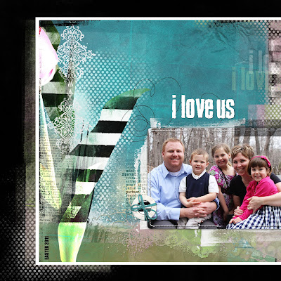
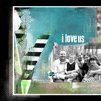
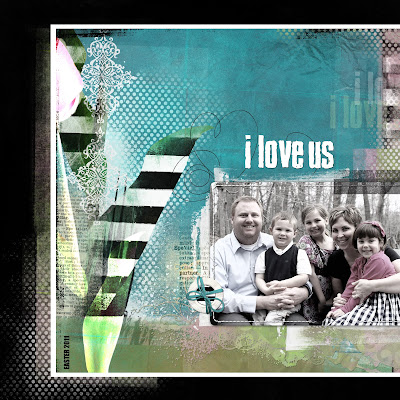
When I am creating a page, I really enjoy playing with the colors of a photo. The colors of an image make such a huge impact in the overall feel of the page. Anna Aspnes just came out with this beautiful new kit called ArtPlay Palette Special One. I couldn't wait to start playing with it. After I positioned everything the way that I wanted, I started playing with the colors of the photo.
In the first image, I kept the color in the photo. I love the colors of the photo but I felt like the colors were too strong for Anna's soft color palette.
 I then tried changing the image to black and white (shift, control, U)... I usually adjust levels when I do this as well but you get the idea. When I made this adjustment, I felt like the photo got lost on the page.
I then used a combination to create this look. There are many ways to achieve this type of coloring in a photo. On this particular page, I used a very simple method. I duplicated the original photo. I positioned one photo on top of the other in the layers palette. On the top photo, I changed it to black and white (shift, control, "U") and then lowered the opacity of that layer which allowed some of the color from the lower photo to shine through. It is such a simple technique but it can be so effective. I liked this layout the best because there was a little "pop" to the picture but it stayed true to Anna's beautiful, soft color palette.
 All products are from Designer Digitals.
I hope you found this helpful. I am always trying to find simple techniques to share with you, if you have any topic ideas, please let me know in the comments. I would love to hear from you.
Have a wonderful weekend!
No comments:
Post a Comment