When I am creating a page, brushwork is always one of the last things that I add. When I look through the online gallery, I really study how people use brushwork. It adds so much to a page.
My favorite type of brushwork would be "Foto Glows" and "Magic Flares" both are created by
Anna Aspnes. If you went through my gallery, you would see an abundance of foto glows and flares. My favorites are
Foto Glows No. 4 and
Magic Flares. I love that they are so easy to use and yet they can make a huge impact on a page.
I'd like to show you some examples of how I use Foto Glows and Magic Flares.
DRAWING ATTENTION TO AN AREAI like to use foto glows and magic flares to draw attention to a particular area of the page. For example if I have a strong photo and the supporting photos are not as crisp, I will use the light that these brushes create to grab the viewer's attention. Here are a few examples:
Here Comes Santa Claus - On this particular page, I used a magic flare to draw the viewer's attention to my favorite photo of "Santa Claus". I think that the flare immediately captures your attention and also adds a feeling of magic to the page...we all know that Santa is magical!

Parading on Main Street - I recently completed my Disneyworld album and I was planning on using a lot of brushwork but then decided that I liked the simple look of a flare behind the title. The flare in this instance is softer because much of it is hidden but it still brings attention to the title portion of the page.

ADDING DEPTH
I also like to use foto glows and flares to add depth to a page. Here are some examples:
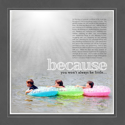
Together - This is a busy page for me. I loved all of these photos so I really wanted to include all of them. When I had finished with the page, I thought it was WAY too busy. Everything just ran together and my eye had a difficult time focusing on one area. I decided to try a flare behind the photo cluster to "give it a little breathing room" and that made a huge difference to me. I felt like this added depth to the page and made the photo cluster take center stage.

Fly Like a Butterfly - This is an art journal page that I did of my daughter. The page contains the very first photo that was ever taken of her as well as a photo that was more recent. You can see on this page how I used the glow to create a sense of distance in the background paper as if the butterfly is flying away. Just one little click of the mouse and it totally changes the whole feel of the page...I love that.

ENHANCE LIGHTING ON YOUR SUBJECT
When I am taking photographs, I am always trying to find the best light for my subject. When I am creating a page, I try to accentuate the light that I have captured in a photograph. You can see in my examples below when there is a beam of natural light on my subject, I will often put a foto glow there to make that beam even stronger.
The Light fo Christmas - You can see on this page that the sun was shining right on my daughter's hair. I think that light played such a significant role in this photo. I decided to enhance the light even more with a flare.

On this Day - Again, you can see that the sun was hitting the top of my son's head so I placed the photo glow appropriately to enhance that aspect of the page.

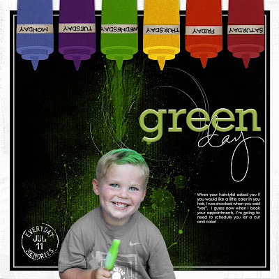
When I am working with a photo in which the natural lighting is poor, I will often use a foto glow or flare to create a sense of light that will illuminate my subject's face. I will often put the flare opposite of my subject to create this type of look.
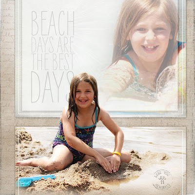
Taste of Summer
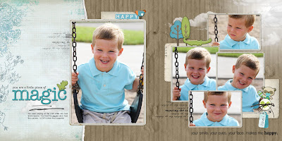
Magical

I am fairly certain that out of all the fabulous products on my computer, foto glows and magic flares have probably been used more than anything else. I just love the versatility of them. When I am stumped with a page, they seem to be my "go-to" technique because they are simple and add alot to a page. If you haven't given them a try, I hope you consider it. I know you will enjoy playing with them.
Thanks for stopping by and have a great day!
 All products are from Designer Digitals.


