Example 1:
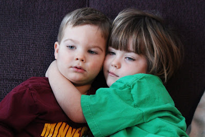
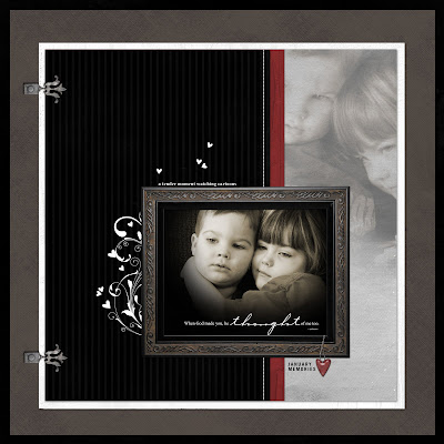
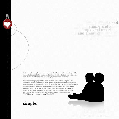
Color conversion is a tool that I use alot. I love to use sepia and black/white combinations to give a piece more interest. I took this photo of my daughter and my son last week. I love the photo because it is just a little glimpse into the love they have for one another. However, I wasn't a big fan of the colors in the photo. I switched the image to black and white and started from there.
This is the final page. I think the "feel" of it is significantly different than the photo that I started with. It is much more dramatic than the original.
Example 2:
I love this picture that I took of my daughter but again, I wasn't a big fan of the colors. I wanted to soften her up a bit so I converted the photo to a combination of color and sepia while leaving her eyes the true color.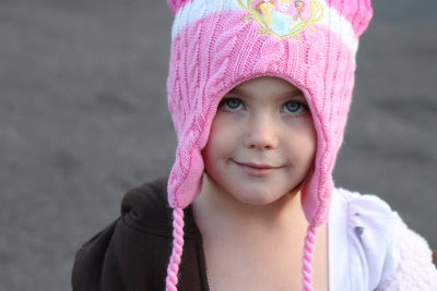
This is the finished project. I think the color conversion really creates a soft feel to the page.

This is the finished project. I think the color conversion really creates a soft feel to the page.
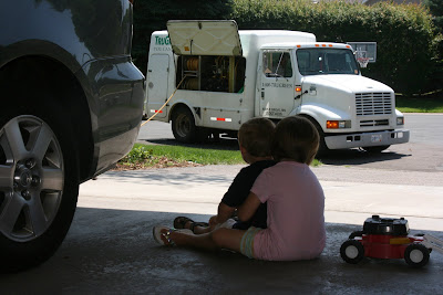
We were outside playing in our front yard, the chemical truck came to treat our yard. I had to run inside for a moment and I told the kids to stay in the garage. When I returned to the garage, this is how they were sitting, it took my breath away. I love the idea behind the photo but the photo itself lacked a lot of things so I converted them into a silhouette.
In the page, I share the story, that I just shared with you. I like how powerful this page is. Their image takes center stage. This is the same image that I used on my blog header although it is flipped.
Example 4:

In the page, I share the story, that I just shared with you. I like how powerful this page is. Their image takes center stage. This is the same image that I used on my blog header although it is flipped.

Example 4:
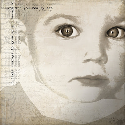
My sister-in-law took this picture of my son. It sure is nice having a photographer in the family. My favorite part of this picture are his eyes. He looks so fearful. I don't think I have ever seen this look from him before. When I created the page, I wanted to keep his eyes as the focal point of the image and cropped him accordingly. I took an awesome digital art class at http://www.debbiehodge.com/ that was taught by Pattie Knox, one of the designers at Designer Digitals. This particular class focused on adjusting thresholds.

This was the final page created from the photo above. After changing the photo to sepia, I adjusted thresholds around his face and kept his eyes as they were in the photo. This is one of my favorite pages that I have ever done. This page was featured in Somerset Digital Studios Fall issue for 2010.
Example 5:

Example 5:
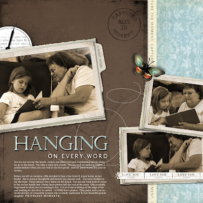
I will admit that I love the color brown. I love photos in sepia, I love scrapping with brown tones. I think a sepia photos gives the image a timeless feel and I'm a big fan of that. I love this series of photos of my daughter and her grandma reading Junie B Jones on the beach with her grandma's kindle. 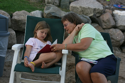
Here is the final page. I think the color conversion really adds a lot to the page.

Here is the final page. I think the color conversion really adds a lot to the page.

As you can see by these examples, I think there are a lot of little things you can do through digital scrapbooking that make a big impact. I hope you found this helpful. Have an awesome day!
All products are from Designer Digitals.

Thank you so much, Jana, for your really helpful and inspirations post!!!!! Hugs, Eszter
ReplyDeleteThis is FABULOUS!!! Just linked it at the Get It Scrapped facebook page and tweeted it.
ReplyDeleteThis is wonderful Jana! So fun to see your adorable kiddos on my FB page with Get it Scrapped! Miss you!
ReplyDelete