I will often create the main portion of my layout first on a 12 x 12 screen filling the entire screen. I think this technique originated because I didn't feel like my pages were done when I initially did this. I wanted to incorporate more paper, more colors and more clustering. I would like to share with you some ways in which I create the page within a page look.
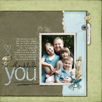
Thankful for you - On this particular page, I created the main portion of the page first. It consisted of the photo of Jeff and the kids, the blue and brown papers, the stitching, the titlework brushwork and clustering around the photo. Once I had that portion of the page created, I then resized it so it was smaller and I could incorporate another color of paper that would frame it. I like to have the main portion of my page off centered a bit. I think it adds more visual interest. After I had the page in place, I always try to tie the main portion of the photo into the background paper so it all flows together. On this page, I tied the two pages together with a simple clustering in which cluster on the top right portion of the inner page overlaps onto my "frame". It is just a subtle little detail of the bird overlapping and the date tag behind that I feel brings this page together.
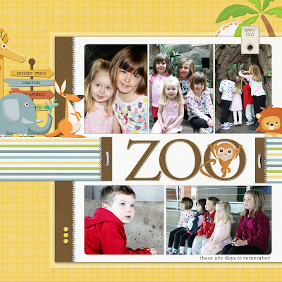
Zoo - On this page, I again created the main portion of the page. As you can see there was a band of striped paper that I had going across the inner portion of the page which at the time filled the entire 12 x 12 screen. When I resized the inner portion of the page, I extended the band to look as though it was anchoring the inner page to the outer page. I also added some additional embellishments behind the focal part of the page that brought these two pages together.
My Little Man - On this page, it is obvious that there are two different pages going on here. On this page, I used shadow work and brushwork to give the page more depth. The shadow technique that I used is the same technique that I shared with you a couple of weeks ago on my blog pertaining to shadowing your title. It is a simple technique but I like the look it creates.
My Heart - You can see that on this page, I have several layers going on. I like to use this look to create depth. Depth is very big in my little world. I think that the photo corners helps unify this entire layout.
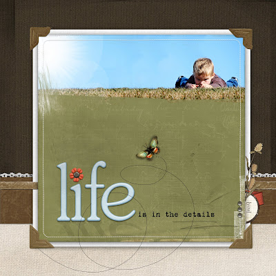
Life is in Details - I created the main portion of this page and it just didn't feel right. If something doesn't feel right, I immediately shrink it to see if I can add some type of framing that will set the page off better. On this page, you can see that I framed it and one of the things that added was a ribbon band (it is actually a frame that I like the texture of) running between the inner page and the white matte behind it. It is subtle but I think it again helps ground the whole page. I also added a cluster behind the inner portion of the page to give it more details as well as the loop da loop from the butterfly that overlapped the inner page and outer page.
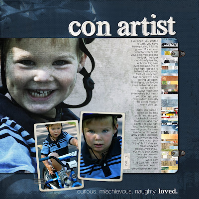
Con Artist - Another technique that I use a lot is called "spilling over". I like to use a blended image and then when I go to frame it, I like it to spill over to the framing on the page. I achieve this look by layering and playing with blending modes and opacity. "Spilling" allows you to frame the focal area of your photo while also incorporating it into the background.
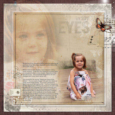
In My Eyes - This is another example of the "spilling over" technique. You can see that I have multiple layers of photos here. I brought them all together with the butterfly and brushwork on the upper right hand corner.
All products are from Designer Digitals.
I think that the "page within a page" look is unique and I think it opens a whole world of possibilities. I hope you found this helpful.
A special "thank you" to Linda for suggesting this topic for my blog. I love sharing my passion with others. I'm thinking about running a series called "Technique Tuesdays" during the summer in which I share a technique that I use with you every Tuesday. If you have ideas for things you would like me to incorporate, please let me know in the comments.
Thanks for stopping by and have a wonderful day!


Jana,
ReplyDeleteI was introduced to you through Masterful scrapbook designs. I absolutely love your pages. I LOVE the spilling over technique, but have quite figured out how to do it. I have played with changing the opacity of the picture and can get it nicely opaque, but can figure out how you get some parts to stay dark and some to fade more. Can you show us how you do that? Thanks so much for the tutorials, I really like them!