Showing posts with label Technique Tuesday - Digital U. Show all posts

Monday, August 22, 2011

Repeating Word Art - Technique Tuesday

Word art is one of my favorite products to add to a page. I love the simplicity of it and it works really well on pages that are very graphic. I think the word "graphic" would describe my style. One of the ways that I have used word art to unify my layout is by incorporating it into the background paper by changing the opacity or even using a blending mode. I love how subtle it is but it ties the whole page together. Here are some examples of ways that I have used word art on my background paper.

Unconditional Love: You can see that I took the word art that I used for the title...made it larger and then duplicated it several times and "sprinkled" it around the page.


When: On this page, I wrote the title "When" in a font (Impact which is one of my favorites) and then stroked the outside so only the outline appeared. I then duplicated the title and blended it into the background in several places.


Believe: I used an alpha on this title. I highlighted the title with marching ants, filled in the layer below it so that the title would have a shadow. I duplicated this shadow a couple of times, changed the opacity of each of these layers and used it as a type of brushwork.


Happiness: Here you can see that I placed the quote and title in multiple places around the page.


Write It: Once again, I duplicated the quote and made it significantly bigger and placed it over the right hand portion of the page. I then reduced the opacity of it. I love how it reinforces my message.


This is just a simple technique but I really like the look of it!


At the beginning of the summer, I decided to bring you "Technique Tuesday". I have really enjoyed sharing some techniques with you and I hope that you have found them helpful. This will be the last installment of Technique Tuesday at least for awhile. I will continue to share techniques with you from time to time because I really enjoy it but it will be more random. Let' s just say that life is hopping and that is a very good thing...busy but good!


Thanks for stopping by and have a wonderful day!

Monday, August 15, 2011

Silhouettes - Technique Tuesday

A few weeks ago we were at this park. Amelia and Quinn were running back and forth through this tunnel laughing hysterically. I just kept taking photos hoping that I could catch the joy in their faces but I knew the lighting was working against me. When I looked at this series of photos on my camera, I will admit that I was bummed because I didn't capture their facial expressions and that is what I REALLY wanted to capture. My pictures got downloaded onto the computer and I didn't even give this series of photos another thought.

Then the other night I was going through photos and this one stopped me in my tracks. I just stared at the computer screen however this time I looked at it in a whole different light. When I really looked at this photo, I found so many things that I loved about it that I didn't see the first time that I saw it. I love that you can see they are in motion...I love the profile shot of Quinn looking at Amelia as he runs by her side...I love the texture of the actual tunnel itself. Although I cannot see their sweet faces laughing, I can hear their laughter when I look at their silhouette. I could have totally disregarded this photo but I looked deeper and found things that I love about it and went with what I had.

I love this silhouette. Here is the original photo...


Although "technically" I added the frame as my last step on this page, I thought you might like to see how it would have looked with just the photo in place.


When I started on this page, I immediately knew that I wanted to make it look like they were running out into the sunset. I decided to extract part of the photo so that just their silhouette and the tunnel remained. Sometimes extractions can be more complicated but this was a simple one. I just used the magnetic lasso tool and traced the edge of the tunnel opening as well as their silhouettes and hit delete. It was as simple as that.


Then I found some beautiful paper by Lynn Grieveson, added some word art, framed it and that was it. The whole page took me less than 20 minutes. I love it when that happens. Here is the end result...


I thought you might like to see some other examples of how I have used silhouettes. I think I wrote about this photo on a previous blog but I will recap. We were outside playing and the chemical truck came to treat our yard. I had to run inside and told the kids to stay in the garage and not go on the grass. When I came back out, I found my daughter and son sitting like this in the garage waiting. This is another photo that I may have disregarded had I not looked deeper. On the surface, I see two kids sitting in a dirty garage next to my van watching a big white truck with a hose coming out of it, spraying icky chemicals on our yard. However, when I removed all of that "stuff", I found a silhouette of a brother and sister who adore one another.


Here is the page that I created with it...


Here is a picture of my husband and our two daughters from years ago. I love this picture. I decided to use this picture for an art journaling class taught by Pattie Knox at Getting It Scrapped. I LOVE learning from Pattie...she is brilliant, she is fun and she is one of the kindest people that I have ever met. By the way, her self-paced classes are all on sale through September 1st.


Here is the page that I created with this photo. This page was published in Somerset Memories 2011 Spring issue.


I created the silhouettes simply by extracting the individuals and then creating a new layer above them. After creating a new layer above them, I filled the silhouette in with black. You can also see that I did some shadow work on these silhouettes. I did a shadow tutorial here if you are interested.


I think it is so important that when you look at your photos, you find their strengths. We are not going to capture the perfect shot every time but if we can "look through different glasses" and find things we love about the photo, we can create meaningful images that capture the heart of the moment. I hope that you look at your photos a little differently after this blog post.


Thanks for stopping by and have a great week!

Monday, August 8, 2011

Titles and Blending Modes - Technique Tuesday

I will admit it...I have a "thing" for anything that involves the word "blending". This would include "Blending Modes". When I am working on a page, I spend most of my time playing with blending modes. When I place something on a page, I will often think to myself...I wonder what it would look like in this blending mode and then twenty minutes later, I find myself still flipping between them.

I just created this page and I had so much fun playing with blending modes not only on the photo itself but also on the title. Who says that blending is only for pictures? I wanted to show you how different the word "ENJOY" looks using the different modes.

This is the final page and I used "hard light" on it...."hard light" happens to be my favorite blending mode...I just love how it makes the item or photo stand out more.


Here is the page using "overlay". I like the transparent look but the title just didn't pop enough against the background.


Here is the title using "multiply". I think it would be safe to say that I "multiply" comes in second place to "hard light" in my book. I use it a lot.


When I began this page, this is what it looked like without a blending mode. I liked it but I wanted the title to become part of the actual photo.


Next time you are playing with titles, don't just keep switching the alpha that you are using. Try playing around with the blending modes to see if you can achieve the look that you desire. I promise you will have fun trying them all out..


I hope you found this helpful. Thanks for stopping by and have a great week!

Monday, July 25, 2011

Changing Color - Technique Tuesday

When I am working on a page, I always try to find digital products that will support my photos. The first thing that I look for when choosing my digital papers, is the color. However, I often find myself looking beyond the color to the texture and "feel" of the paper.

When I think about the products that I have available, I think it is important to keep my mind open to all of the possibilities of these products. I love to change colors, blend products, distort them to achieve dimension...you name it....I like to try it.

I would like to show you some examples of how I manipulate products to fit my vision for a page. This piece of digital paper is by Anna Aspnes. It is from her ArtPlay Palette Seafoam Kit. I LOVE this kit. I started working on some beach pages and I was instantly drawn to the texture of this paper. It felt grainy to me and I thought it would be perfect for my pages. When I started working on my pages, I found that the color was a little off but I still wanted to use it because it contained the texture that set the stage for my pictures.


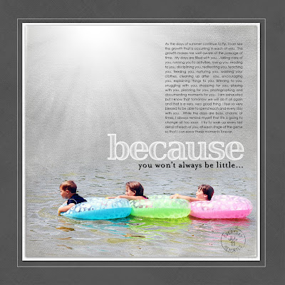
Because - I used the SeaFoam paper from above for this page. I made a simple adjustment by changing it to black and white (shift-control-u) and then adjusting the levels to fit my photo. I used some blending to make the texture of the paper shine through my photo.


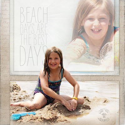
Beach Days - On the page below, I used the exact same paper as my background paper. You can see that this time, I changed the color of it to a sepia tone.


I first made sure that my foreground color was set to the default color of black and my background color was set to white. I then went to "Image"..."Adjustments"...."Hue/Saturation"....checked "Colorize" and played with the sliding scales until I achieved a color that I thought fit with my photos. In this particular case, my numbers were Hue: 45, Saturation: 12, Lightness: 0


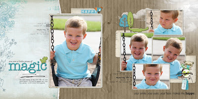
Magic -On this page, I blended two digital papers together to get one. Katie Pertiet has a GORGEOUS new kit coming out this weekend called Artistry Azul. This contains my very favorite blues. It might be difficult to see but on this page, I blended two of the papers together. I love all of the papers in this kit but on this page, I wanted a paper with aqua flourishes so I used an aqua color as the base color on the left and then I took a beautiful white paper with blue flourishes and placed it on top of the other paper. I then changed the blending mode of the top paper to Multiply (one of my favorite blending modes) and I was happy with my aqua paper with flourishes.


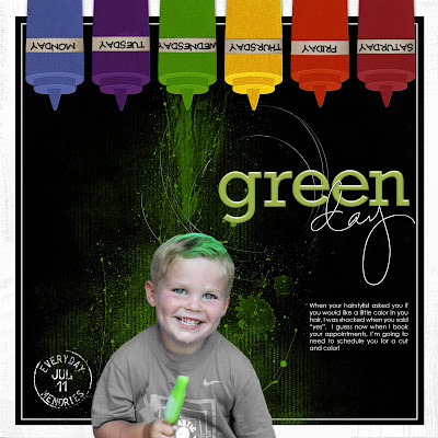
Green Day - This is a crazy layout that I did for the fun challenge on Kayleigh's blog. On this page, I used a red ketchup bottle from Pattie Knox's cute kit "BBQ Bash Kit" and changed the color five times to make a rainbow of hair coloring products. I was able to do this just by going into "Image"..."Adjustments" and then changing the "Color Balance" by sliding the scales.


The Gang - On this page, I changed the color of the tree. This tree which I have used a lot is from Lynn Grieveson's kit "Gran's Garden". The tree is really pink but I needed it to be green to pop off of my pink background. I took the magic wand tool, tapped on an original pink leaf (I made sure that continguous was not checked because I wanted all of the leaves on the tree to turn green...my tolerance was set at 32 and "anti-alias" was checked). Once I had the marching ants around my desired area, I just filled it in with the color that I wanted.


3- On this page, I just made a minor adjustment on the choo-choo train. In the original train, the highlight colors were red. I needed them to be orange to match the rest of my layout. I used the above technique to change the red on the train to orange so it all flowed together.


All products are from Designer Digitals.


When I am working with products, I always keep in mind how versatile they are. When you think about all of the products that you have and then think about changing their color and texture and so on, the amount of products that you have explodes. There are so many little things you can do that can help maximize the capabilities of your products.


I hope you found this helpful. We are leaving on vacation next weekend. I apologize but there will not be "Technique Tuesday" on August 2nd. It will resume again on August 9th. Thanks so much for stopping by and have a great day!

Monday, July 18, 2011

Lighting - Technique Tuesday

When I am creating a page, brushwork is always one of the last things that I add. When I look through the online gallery, I really study how people use brushwork. It adds so much to a page.

My favorite type of brushwork would be "Foto Glows" and "Magic Flares" both are created by Anna Aspnes. If you went through my gallery, you would see an abundance of foto glows and flares. My favorites are Foto Glows No. 4 and Magic Flares. I love that they are so easy to use and yet they can make a huge impact on a page.

I'd like to show you some examples of how I use Foto Glows and Magic Flares.


DRAWING ATTENTION TO AN AREA

I like to use foto glows and magic flares to draw attention to a particular area of the page. For example if I have a strong photo and the supporting photos are not as crisp, I will use the light that these brushes create to grab the viewer's attention. Here are a few examples:

Here Comes Santa Claus - On this particular page, I used a magic flare to draw the viewer's attention to my favorite photo of "Santa Claus". I think that the flare immediately captures your attention and also adds a feeling of magic to the page...we all know that Santa is magical!


Parading on Main Street - I recently completed my Disneyworld album and I was planning on using a lot of brushwork but then decided that I liked the simple look of a flare behind the title. The flare in this instance is softer because much of it is hidden but it still brings attention to the title portion of the page.


ADDING DEPTH


I also like to use foto glows and flares to add depth to a page. Here are some examples:

Together - This is a busy page for me. I loved all of these photos so I really wanted to include all of them. When I had finished with the page, I thought it was WAY too busy. Everything just ran together and my eye had a difficult time focusing on one area. I decided to try a flare behind the photo cluster to "give it a little breathing room" and that made a huge difference to me. I felt like this added depth to the page and made the photo cluster take center stage.


Fly Like a Butterfly - This is an art journal page that I did of my daughter. The page contains the very first photo that was ever taken of her as well as a photo that was more recent. You can see on this page how I used the glow to create a sense of distance in the background paper as if the butterfly is flying away. Just one little click of the mouse and it totally changes the whole feel of the page...I love that.


ENHANCE LIGHTING ON YOUR SUBJECT

When I am taking photographs, I am always trying to find the best light for my subject. When I am creating a page, I try to accentuate the light that I have captured in a photograph. You can see in my examples below when there is a beam of natural light on my subject, I will often put a foto glow there to make that beam even stronger.


The Light fo Christmas - You can see on this page that the sun was shining right on my daughter's hair. I think that light played such a significant role in this photo. I decided to enhance the light even more with a flare.


On this Day - Again, you can see that the sun was hitting the top of my son's head so I placed the photo glow appropriately to enhance that aspect of the page.


When I am working with a photo in which the natural lighting is poor, I will often use a foto glow or flare to create a sense of light that will illuminate my subject's face. I will often put the flare opposite of my subject to create this type of look.


Taste of Summer

Magical


All products are from Designer Digitals.


I am fairly certain that out of all the fabulous products on my computer, foto glows and magic flares have probably been used more than anything else. I just love the versatility of them. When I am stumped with a page, they seem to be my "go-to" technique because they are simple and add alot to a page. If you haven't given them a try, I hope you consider it. I know you will enjoy playing with them.


Thanks for stopping by and have a great day!

Monday, July 11, 2011

Distortion - Technique Tuesday

When I design my pages, I really like to incorporate depth and dimension in my pages. One of the ways that I do this is by distorting things such as text, images, and elements. When I get an idea in my head, I usually just sit at the computer and play until I figure out how to manipulate the screen to fit my vision. I posted this page earlier in the week. It contains a photo of my daughter when she was sixth months old that was taken on the fourth of July as well as a photo that I took of her just last week on the fourth. I wanted to make the image appear as if it were a mirror and the photos were facing one another. I thought I would share with you how I created the "mirror effect".


Step 1: The first thing that I did was create a rectangle using the marquee tool. Easy enough...right!


Step 2: Once I had the rectangle in place and that particular layer highlighted, I hit "Control - T" so that I could adjust the shape of the rectangle. I then clicked simultaneously the left mouse, shift and control. (I should note again that I am using Photoshop CS2) This allows me to drag out the shape in all different manners. I simply created the shape below by pulling on the left corners of the rectangle to get this desired shape.


Step 3: I then duplicated the image (control - j) and positioned the duplicate layer so it was "facing" the other side. I simply did this by dragging it into postion. This is what my "mirror" looks like now. Step 4: I then attached my images to the "mirror" and placed some hinges between the sides. I did not distort the photos in this case but I thought about doing that. I decided not to do that because I love the photos of my daughter just as they are and I didn't want to mess with them. You can also see on the final page that I used the shadow technique that I described a few weeks ago to make the "mirror" appear like it is sitting on the counter. The shadow just gives it one more piece of added dimension.


Here are a few additional pages that I distorted some aspect to give it dimension.


Days with You: On the bottom of this page, I used a blended image of a clock by Anna Aspnes and I distorted the clock using the method above.


aDORAble: I'm a huge fan of loop da loops. On this page, I distorted the loop da loop to make it appear like it was circling my son and the characters.


Rain: This page is a little bit more complicated but it all started by distorting the word "RAIN" on the bottom to make it look like my son was standing on the word.


All products are from Designer Digitals.


I hope you found this helpful. I would certainly love to see you put this to use. It is really an easy technique and once you start playing with it, the possibilities are endless.


Thanks for stopping by and happy Tuesday!

Monday, July 4, 2011

"Vellum" - Technique Tuesday

Back in the day, when I was a paper scrapper, I loved to use vellum. I just liked the soft touch of layering that it brought to my layouts. The only problem was that it was relatively expensive in terms of paper so I didn't use it all that much. Once I entered the digital world, I found that I enjoyed using vellum as well except now I could create my own "vellum" and it was FREE...love that!

I will often use "vellum" when I want to frame something or if I want to add just a little bit more dimension to my layout. It is very simple technique to use. I use the rectangular marquee tool. I create a box based on the shape that I am trying to frame. I will then lower the opacity of the box until it feels right. The opacity really varies depending on the look that I am trying to achieve especially if I am using it to soften a blended photo.

I included some layouts in which I used my version of "vellum". On "Beauty", you can see that I used two vertical strips of vellum on the edge of the photo. I reduced the opacity to almost zero but then added a shadow to it, to give it a little dimension and frame the focal area of the page. On "Golden", I used the vellum to add dimension and frame in the blended image in the background.


On "My Sweet Love", I used vellum to give my paper a slight contrast in color. I think I could call this the "lazy woman's way of scrapping". Instead of trying to find another sheet of digital paper that was close to my background paper, I just used the vellum overlay to give it that slight variation in color.


On "Wannabe", I again used the vellum to soften the blended image and then I place a stroke around the edge to frame the vellum.


Again, I created more depth on my background photo and papers by framing my son's face.


"Instant Drool" is another example of this technique.


All products are from Designer Digitals.


I hope you found this useful. It is just a simple technique that I have gone to time and time again over the last few years. I hope you give it a try.


A few of you have been kind enough to leave me some comments and "thank you" so much for the feedback. I have received a number of comments from people asking about my blending process. In June, I did a webinar with Debbie Hodge at Masterful Scrapbook Designs. It was a lot of fun. There seemed to be some interest in an additional webinar or series in which people could see my screen and get a peek into my creative process. I would love to share this with you. Debbie and I are working on this and hopefully I will have more information for you soon. Thank you so much for your feedback and interest. I really appreciate it.


I hope you have a wonderful day and thanks for stopping by.

Tuesday, June 28, 2011

Page within a Page - Technique Tuesday

When I post pages in my gallery, I often get this comment..."I know it is one of your pages before I even click on the thumbnail". I guess this means that I have a very unique style. I think there are several techniques that I really like to use that give my pages their own style. One of these techniques that I often use, I refer to as "a page within a page".

I will often create the main portion of my layout first on a 12 x 12 screen filling the entire screen. I think this technique originated because I didn't feel like my pages were done when I initially did this. I wanted to incorporate more paper, more colors and more clustering. I would like to share with you some ways in which I create the page within a page look.

Thankful for you - On this particular page, I created the main portion of the page first. It consisted of the photo of Jeff and the kids, the blue and brown papers, the stitching, the titlework brushwork and clustering around the photo. Once I had that portion of the page created, I then resized it so it was smaller and I could incorporate another color of paper that would frame it. I like to have the main portion of my page off centered a bit. I think it adds more visual interest. After I had the page in place, I always try to tie the main portion of the photo into the background paper so it all flows together. On this page, I tied the two pages together with a simple clustering in which cluster on the top right portion of the inner page overlaps onto my "frame". It is just a subtle little detail of the bird overlapping and the date tag behind that I feel brings this page together.

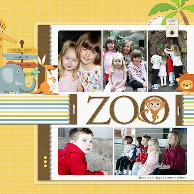
Zoo - On this page, I again created the main portion of the page. As you can see there was a band of striped paper that I had going across the inner portion of the page which at the time filled the entire 12 x 12 screen. When I resized the inner portion of the page, I extended the band to look as though it was anchoring the inner page to the outer page. I also added some additional embellishments behind the focal part of the page that brought these two pages together.


My Little Man - On this page, it is obvious that there are two different pages going on here. On this page, I used shadow work and brushwork to give the page more depth. The shadow technique that I used is the same technique that I shared with you a couple of weeks ago on my blog pertaining to shadowing your title. It is a simple technique but I like the look it creates.


My Heart - You can see that on this page, I have several layers going on. I like to use this look to create depth. Depth is very big in my little world. I think that the photo corners helps unify this entire layout.


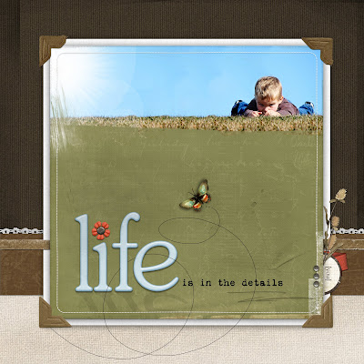
Life is in Details - I created the main portion of this page and it just didn't feel right. If something doesn't feel right, I immediately shrink it to see if I can add some type of framing that will set the page off better. On this page, you can see that I framed it and one of the things that added was a ribbon band (it is actually a frame that I like the texture of) running between the inner page and the white matte behind it. It is subtle but I think it again helps ground the whole page. I also added a cluster behind the inner portion of the page to give it more details as well as the loop da loop from the butterfly that overlapped the inner page and outer page.


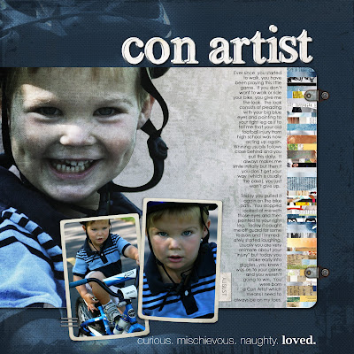
Con Artist - Another technique that I use a lot is called "spilling over". I like to use a blended image and then when I go to frame it, I like it to spill over to the framing on the page. I achieve this look by layering and playing with blending modes and opacity. "Spilling" allows you to frame the focal area of your photo while also incorporating it into the background.


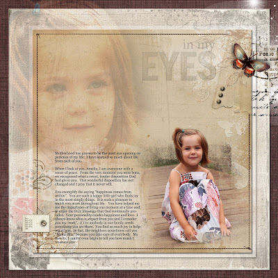
In My Eyes - This is another example of the "spilling over" technique. You can see that I have multiple layers of photos here. I brought them all together with the butterfly and brushwork on the upper right hand corner.


All products are from Designer Digitals.


I think that the "page within a page" look is unique and I think it opens a whole world of possibilities. I hope you found this helpful.


A special "thank you" to Linda for suggesting this topic for my blog. I love sharing my passion with others. I'm thinking about running a series called "Technique Tuesdays" during the summer in which I share a technique that I use with you every Tuesday. If you have ideas for things you would like me to incorporate, please let me know in the comments.


Thanks for stopping by and have a wonderful day!